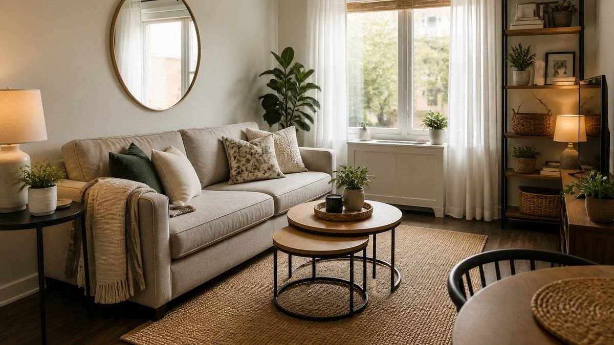
Small living room wall decor starts with one focal wall. Pick the surface your eye lands on first, build it out properly, and let the rest of the room go quiet. That single choice does more for a compact room than any mirror, print, or shelf arrangement you add afterward.
You see the problem every time you walk in. The wall behind the sofa sits bare, the one beside the door carries a lone small frame that looks lost, and the stretch above the television does nothing at all. Nothing connects, so the room reads smaller than its square footage.
The week the tape measure finally came out, the wall behind the sofa turned out to hold a 48-inch piece comfortably. The plan had revolved around a 24-inch frame for months. Both would have been fine. One of them would have looked wrong.
Pick One Focal Wall and Let the Others Recede
Decorate the wall you see first when you enter, usually the one behind the sofa or opposite the doorway. Everything else on that wall works as one composition, and the side walls get only light accents.
Which wall earns the role? Three tests settle it. The wall you see when you walk through the door. The wall behind the main seating. And the wall that already has a visual anchor, like a fireplace or a built-in. If two candidates tie, the sofa wall wins, because that is the surface people face for the entire evening. Start there.
Once the focal wall is chosen, treat everything on it as a single composition. A large mirror over the sofa, two shelves flanking it, a console below. The eye should read the whole arrangement at once. That coherence is what makes a narrow room feel intentional rather than busy.
The other walls get a lighter touch: one medium piece where a hallway opens in, a row of small frames only if they read as a set, curtains doing the talking on a window wall. If a wall has no job, it does not need decor.
Give the focal wall three elements and no more: a main piece, a secondary object, and something with depth, like a sconce or a shelf. The main piece sets the size, the secondary object answers it, and the third element keeps the arrangement from looking flat. The eye should be able to travel that line without stopping.
This is also where the room’s layout and its wall plan meet. If the furniture itself needs work first, the space-planning side has its own guide, small living room decor ideas that maximize space; the wall treatment above is the finishing layer on top of that.
Use the Walls to Make the Room Feel Bigger
Mirrors, pale wall colors, and vertical lines are the three wall treatments that genuinely expand a small room. A mirror opposite a window doubles the incoming light, light walls make the boundaries recede, and vertical elements pull the eye upward.
Start with the mirror because it does two jobs at once. Placed across from a window, it reflects daylight into the dark half of the room and gives the wall an apparent second room behind the glass. Size matters here: a mirror that reads as an afterthought, eighteen inches wide on a long wall, just adds clutter. Go for the largest piece the wall will hold with breathing room on both sides.
Wall color follows a simpler logic. A pale wall reflects more light back into the room than a dark one does, and that reflected light is what widens the perceived boundaries. This does not mean every small room should be white. A mid-tone wall with strong contrast trim can look sharp and still bounce enough light, because the eye reads the lighter trim as the frame and lets the wall fall back behind it.
Vertical lines do the height work. Floor-to-ceiling drapery, a tall narrow mirror, stacked shelves, or a subtle striped wallpaper all push the eye up, which reads as more volume. Horizontal lines widen what they touch, so a room with low ceilings gets worse when everything hangs at the same mid-wall height.
Mount the mirror so its center sits near eye level, about 57–60 inches up, the same height you would use for art. A mirror hung too high reflects the ceiling, which is rarely the view you want; at eye level it reflects the room and its light.
On paint, the safe zone for a compact room is the warm white family rather than cool white. Benjamin Moore White Dove and Sherwin-Williams Alabaster are the two most common picks because they read as bright without going clinical. Cool whites reflect the same light but leave the room feeling flatter.
One caution on dark accent walls: they work in rooms with strong natural light and fail in ones without it. A deep green wall in a windowless corner eats light that a compact room cannot spare. Save the dark paint for the wall that gets direct sun, or skip it entirely.
Hang Art by Proportion, Not by Guesswork
Center art over the sofa with its bottom edge 6–8 inches above the back, span roughly two-thirds of the sofa width, and keep the midpoint near eye level. Group odd numbers, leave even spacing, and let one large piece do the work of three small ones.
The two-thirds rule is the one worth memorizing. A 90-inch sofa wants art around 60 inches wide, hung so the arrangement’s midpoint sits about 57–60 inches from the floor, which is average standing eye level. The bottom edge lands 6–8 inches above the sofa back. These are the numbers designers keep quoting because they reliably produce a composed look in rooms of any size.
When a single piece does not fit that wall, grouping does. The 3-5-7 rule is the decorator’s shorthand for odd-numbered groupings: three works best for most walls, five for a long run, seven only when the wall is genuinely wide. It is not a law of physics. It works because an odd count gives the arrangement a center piece, and the eye lands on that center instead of scanning a pair.
Gallery walls follow the same logic at larger scale. Lay the frames on the floor first, arrange them by weight and color, and keep the gaps between frames consistent, usually 2–3 inches. Transfer the layout with kraft paper templates taped to the wall so the first nail lands correctly the first time. A gallery wall built around family photos follows these same rules whether it hangs here or in a family room wall decor setup.
If you are weighing formats rather than individual pieces, the four main options sort out by room size, effort, and budget.
| Format | Best for | Effort | Cost class |
|---|---|---|---|
| Gallery wall | Long walls, personal collections | High: many pieces to hang | Low to mid; frames add up |
| One large piece | Small rooms, sofa walls | Low: one nail | Mid to high |
| Statement mirror | Dark rooms, narrow walls | Low | Mid |
| Floating shelves | Combining display with storage | Mid: studs and leveling | Low to mid |
To build a gallery wall without tears:
- Choose the frames first and lay them on the floor.
- Arrange them by size, with the largest near the center and the darkest tones balanced across.
- Measure the whole arrangement as one rectangle and mark its center.
- Tape kraft-paper templates to the wall, adjust, then hang.
Read the table above as a sequence, not a menu. A compact room with one sofa wall gets the single large piece; the same wall in a wider room can carry a gallery; the mirror is the upgrade when the room runs dark. A single large piece does the work of three small ones, and it needs one nail.
Lighting belongs in the wall plan too. A picture light above the main artwork, or a pair of sconces flanking a mirror, turns a flat composition into a layered one after dark. It also fixes the classic small-room problem of a single overhead fixture washing everything out.
Turn Dead Wall Space Into Storage
Floating shelves, wall-mounted cabinets, and corner units add storage without touching the floor, which is the real constraint in a compact room. Mount them at chest height or above and style them in odd groupings so they read as display, not clutter.
Floating shelves are the workhorse. Screw them into studs or use proper hollow-wall anchors, keep each shelf to a modest load, and stagger two or three at different heights rather than aligning them like a ladder. The staggered line is more forgiving to look at, and it hides the fact that you are storing, not decorating.
The corner is the wasted space. A narrow corner unit or a trio of small shelves turns a dead junction into the room’s most useful square foot, holding books, a plant, or the remotes that otherwise live on the coffee table.
Height decides what a shelf is for. Shelves below eye level read as storage; shelves at or above eye level read as display. Most living rooms want one run of each, not a wall of either.
The television wall deserves its own treatment. Instead of mounting the screen and calling it done, build the wall around it: one floating shelf above, a slim media cabinet below, and a single plant or lamp breaking the vertical line. The composition keeps the electronics from becoming the room’s only focal point, which is what happens when you mount a television and walk away from the wall.
My own television wall went through three arrangements before it settled. First the screen alone, then the screen with two tiny prints beside it, then one shelf, one plant, and the screen. The third version is the only one I stopped noticing.
Mistakes That Make a Small Room Feel Smaller
Hanging everything at the same height, covering every wall, choosing prints that are too small, and ignoring the television wall are the four errors that most reliably shrink a small living room. Each has a straightforward fix.
A punch list, since the fixes are short:
- Small prints scattered alone. A 12-inch frame floating on a ten-foot wall reads as a mistake. Group small frames into one composition, or trade them for a single larger piece.
- Everything hung at eye level. Uniform mid-wall art creates a stripe that visually lowers the ceiling. Vary heights on purpose: one piece sits higher, another lower.
- Every wall decorated. Symmetry across four walls makes the room feel boxed in. Leave at least one wall, usually the one without windows or furniture, completely bare.
- Art wider than the sofa. A piece that overhangs the seating on both sides makes the sofa look undersized. Keep the arrangement within the sofa’s width, roughly two-thirds.
- Shelves on every wall above eye level. Storage that crowds the perimeter pushes the walls inward. Cap the number of shelving runs at two, and let the rest of the wall breathe.
Two situations call for a different playbook. If the room is under about ten feet wide, skip the gallery wall and commit to one strong piece, because tight rooms read best with a single anchor. If you rent and cannot nail into the wall, the rules compress into command strips for lightweight frames, peel-and-stick wallpaper on one accent wall, and floor-leaning art that never touches the drywall.
The pattern behind all five mistakes is adding. In a compact room the wall plan is subtractive: one wall leads, the others support, and the room starts looking bigger once you stop adding to it.
Frequently Asked Questions
How to decorate a small living room wall?
Start with one focal wall, add one large piece or a mirror, and keep the rest of the walls light. This formula is the backbone of small living room wall decor at any budget. Choose the wall you see first when you enter, usually behind the sofa. Hang one piece that spans about two-thirds of the sofa’s width, keep the bottom edge 6–8 inches above the back, and let the side walls stay nearly bare. Light colors and vertical elements do the rest.
What is the 3-5-7 rule in interior design?
The 3-5-7 rule is the decorator’s guideline for odd-numbered groupings: three items for most arrangements, five for a longer run, seven for a wide wall. It is a memory aid, not a rule of physics. An odd count gives the arrangement a center piece, so the eye has somewhere to land. That is why the guideline keeps appearing in mantel and shelf styling.
What should I put on my walls in my living room?
A mirror, one large piece of art, or a curated shelf group are the strongest choices for a living room wall. Put the strongest piece on the wall you see first. A mirror adds light and apparent depth, a single large artwork gives the room a focal point, and a floating shelf group combines display with storage. Keep family photos and smaller prints together in one gallery arrangement rather than scattered across the room.
What is the wall decor for 2026?
For 2026, wall decor is moving toward natural textures, vintage mirrors, warm tones, and fewer, larger pieces. The current direction favors more texture and less clutter: woven wall hangings, cane and rattan pieces, sculptural objects instead of flat prints, and mirrors with arched or organic frames. Warm whites and earthy tones are replacing cool grays. For a small room this trend is convenient, since larger single pieces and textured surfaces are exactly what read best in tight spaces.